If you’ve ever worked on a project where very little — if any — attempt was made to keep everyone involved up to speed with development, then you’ll certainly understand how infuriating this can be.
In fact, even those who were blessed enough to have never suffered the ordeal will more than likely still relate, at least on an intellectual level. The Dalai Lama, for instance, while never once a software guru, famously stated that “a lack of transparency results in distrust and a deep sense of insecurity.”
And naturally, here at Software Planet, we couldn’t be more in agreement.
This is why we have put in place a series of mechanisms that can guarantee that you, our valued customers, will be kept informed at all times.
Yet of all of these, perhaps the best example is that of our software metrics.

So what are they?
Put simply, software metrics are efficient charts and diagrams that are able to promote a visual understanding of a particular aspect of a project’s development.
In the Agile world, programmers rely heavily on these charts to measure the progress and success of a project, manage workloads, identify areas of improvement, reduce overtime and costs, and increase return on investment.
The following are just a few of our most used techniques:
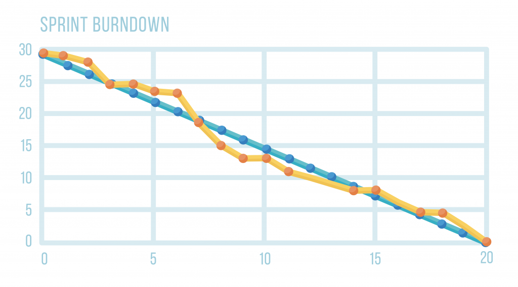
Sprint Burndown
In a Sprint Burndown chart, the X-axis represents time, while the Y-axis corresponds to the amount of work that must still be completed by the development team. This is either measured in hours or story points. In this way, the chart is able to show the completed work per day versus the projected rate of completion for the current iteration.
Or, in simpler terms, we are able to discover exactly where we stand in relation to our schedule. The main benefit here is that by joining this data with our customers’ own insightful feedback, we can reassess if necessary and efficiently plan the following iteration.
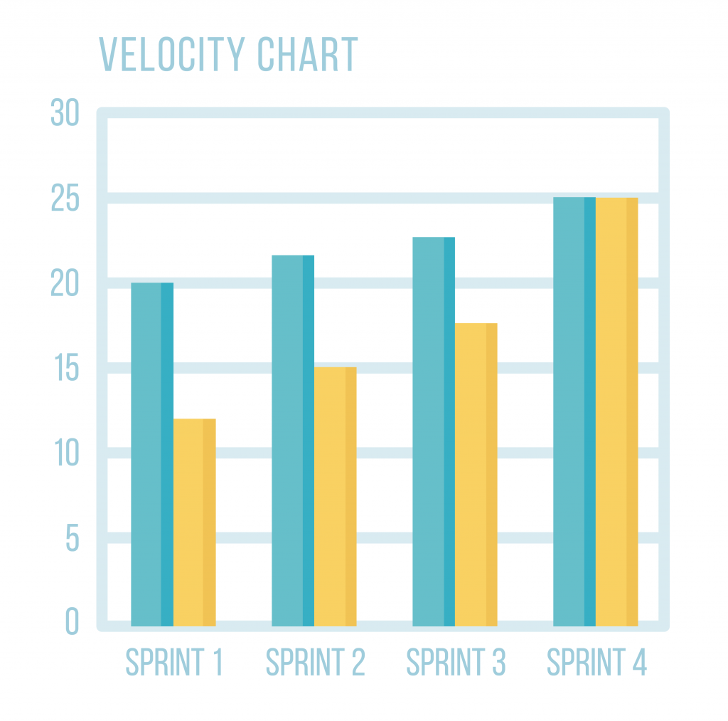
Velocity
To evaluate a team’s performance and observe how this improves or declines over time, we make use of Velocity charts.
These simple bar graphs compare every completed Sprint in order to determine the average amount of accomplished work in relation to the team’s initial commitment. If, therefore, on any given Sprint, 20 story points had been aimed for but only 15 achieved, the velocity chart would lay this bare for all to see — and consequently, to correct.
Unsurprisingly, Velocity charts are also extremely useful as predictors.
Should, for example, the product owner wish to finish 300 story points from the backlog, and we know from our Velocity chart that the development team is currently working at an average of 30 points per iteration, we can somewhat safely assume that the team will need approximately 10 Sprints to bring the job to completion.
Happiness Graphs
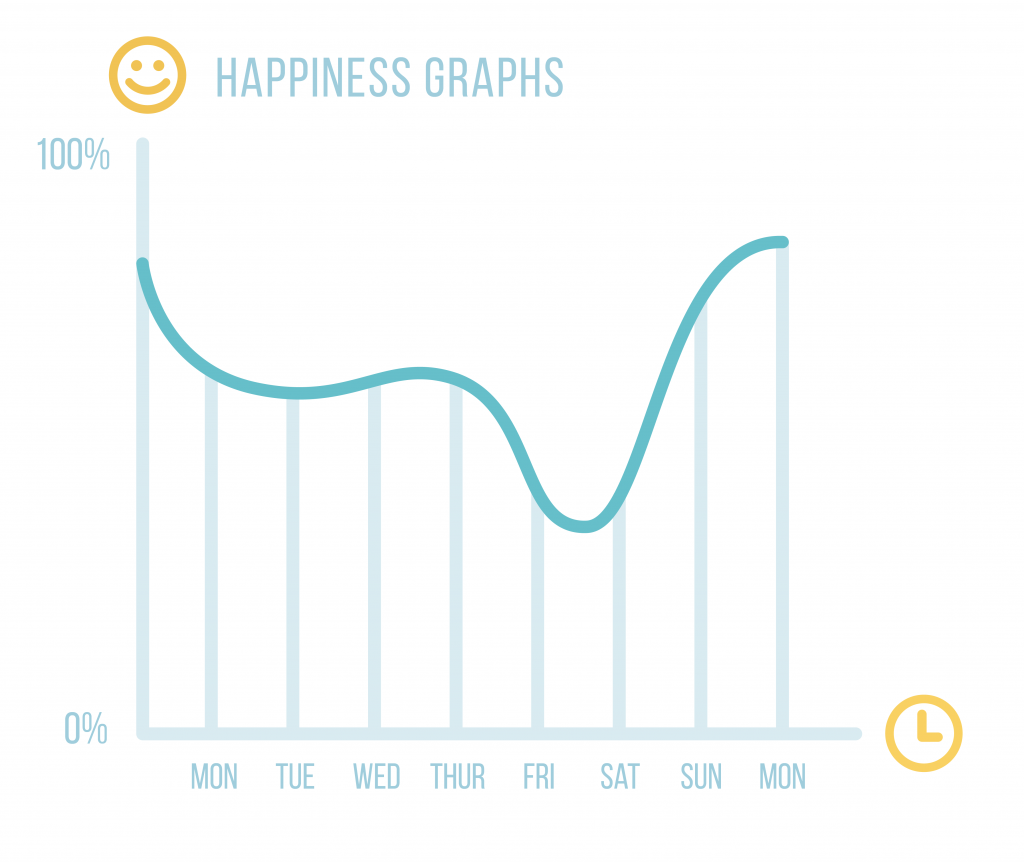
Another interesting — and very Agile — approach to metrics is seen in the happiness graph. Although not directly related to the project itself, this diagram is an indispensable tool for gauging the mood of both customers and developers.
The process varies, but it is also fairly straightforward. At any given time, but more often during retrospectives, we ask everyone a simple question, such as “on a scale from 1 to 5, how happy are you with this project?” This allows us to generate a simple line graph that can accurately portray the shifting levels of satisfaction within teams and organisations.
Effectively, we can then asses the general health of our working relationships and use this information to assist us in improving their overall condition.
Release Burndown
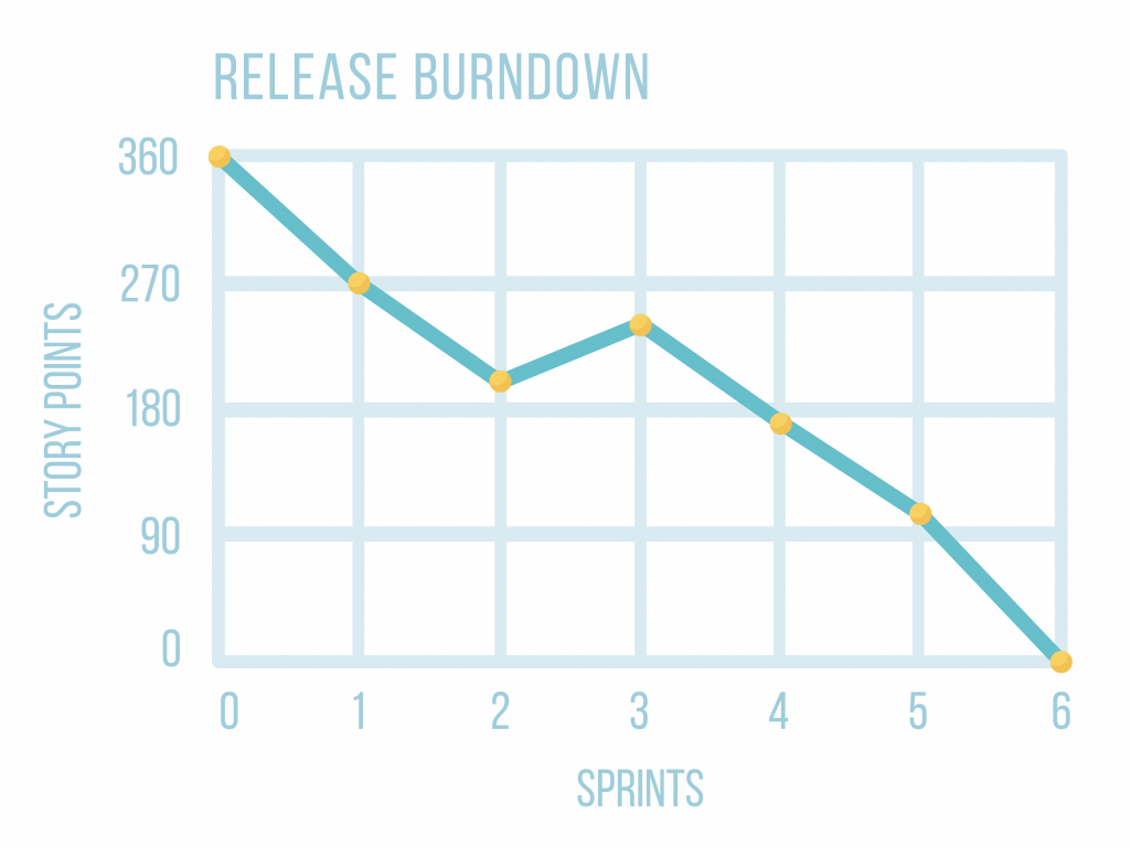
Finally, we use the Release Burndown chart to track all the progress that has been made in relation to the entire project.
Here, while the horizontal axis represents each Sprint to date, the vertical one is concerned with the work that still remains at the start of every iteration.
Beyond the obvious benefits, the Release Burndown chart empowers teams to self-organise, self-manage and self-direct themselves towards meeting the ultimate goal of your target release date.
A word of wisdom
While the venerable Dalai Lama has undeniable wisdom to spare, had he been a software guru, we suspect his words on openness would have probably gone even further:
A lack of transparency, beyond resulting in distrust and insecurity, promotes anxiety and frustration at every level, and often culminates in the derailing or even abandoning of entire projects.
In stark contrast, however, by maintaining the free flow of communication through the power of metrics and advocating a fully transparent development process, we create a space where ideas can flourish, and projects can thrive.


