If you’re a regular blog reader, perhaps you’ve taken notice of our periodical illustrations and wondered how your own company could benefit from the same results — after all, man shall not live on software development alone!
So for today’s article, we’re handing the mic over to our incredible graphic designers as they reveal the secrets behind our proven illustration technique.

The method
Throughout the years, the method we have outlined below has served Software Planet Group extremely well, as we’ve used it to quickly generate a multitude of essential images — for brochures, websites, posters and leaflets.
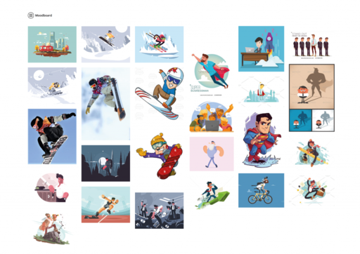
The first step in our design process is to create a tentative mood board. Despite the curious name, this is nothing but a helpful collection of inspiring, interesting images that is put together by our design team as soon as they have read the piece requiring an illustration. During this phase, we briefly discuss the matter with the appropriate stakeholder — customer or manager, depending on the project — and research any topics that we think may be important to recreate the atmosphere of the original written piece.
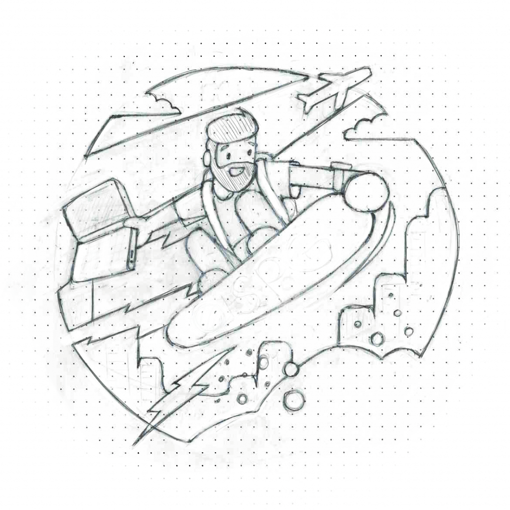
Next, using a simple pen and paper, we prepare our rough sketches, which will form the basis for the entire composition. Then, from a limited pool of options — no more than 2 or 3 — the customer or manager will select their favourite drawing, greenlighting the project to move on to the next stage.
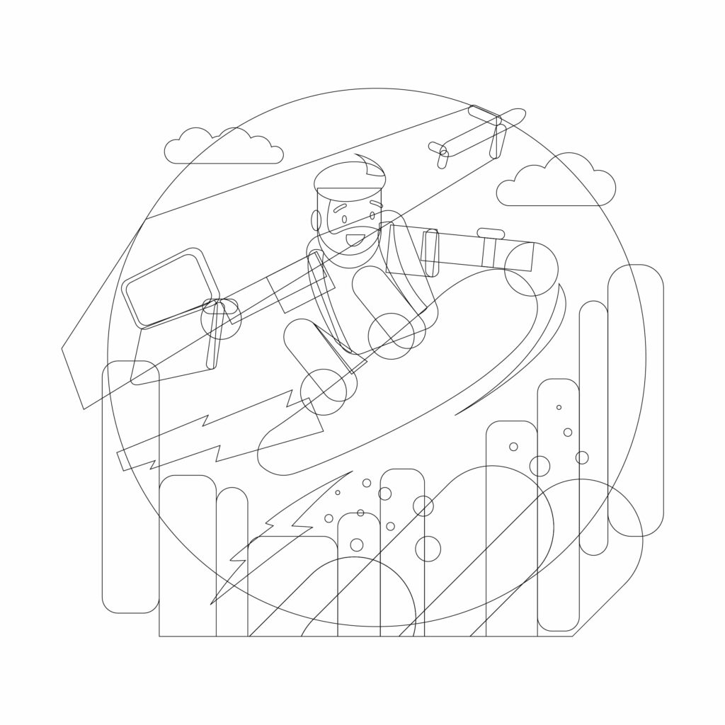
Once we know which sketch to proceed with, we transpose it to a vector editor like Adobe Illustrator or Sketch…
…after which we then create a grayscale version of it. This is done because without colour, there are no additional distractions. All that is being judged is the quality of the image itself.
And finally, our designers play around with a variety of different colours to establish how the project should all come together in the end. This will give us just a few more choices to ensure we are selecting the best possible illustration.
It is worth pointing out, however, that forward motion is of the utmost importance here. Throughout this process, we work thoroughly so as to never have to return to a previous, completed stage.
But apart from that, that’s about it! With the help of this incredibly straightforward design technique, SPG have kept up with a number of different projects — while efficiently meeting all their tireless design demands! We recommend it to creatives everywhere, as it may also be adapted to a plethora of other art forms.
Tell us what you think!
What are your thoughts on our illustration process and how does it compare to the one used at your own company? Are there any questions that spring to mind? Let us know on our Facebook page.


